CASE STUDY: BEFORE The Joffrey Balet School's visual message was inconsistent, pastel and lacking energy and emotion.
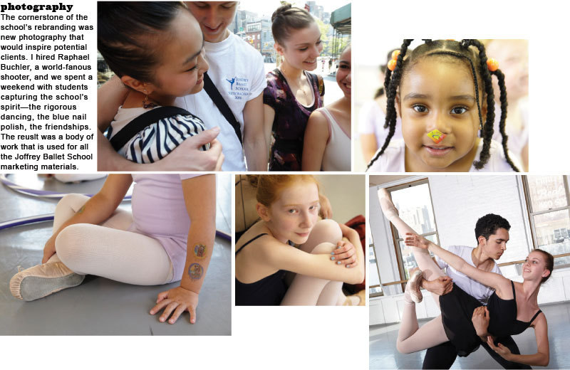
CASE STUDY New photography for the website, brochures and ads. Natural light and unstaged moments capture the true spirit of the school.
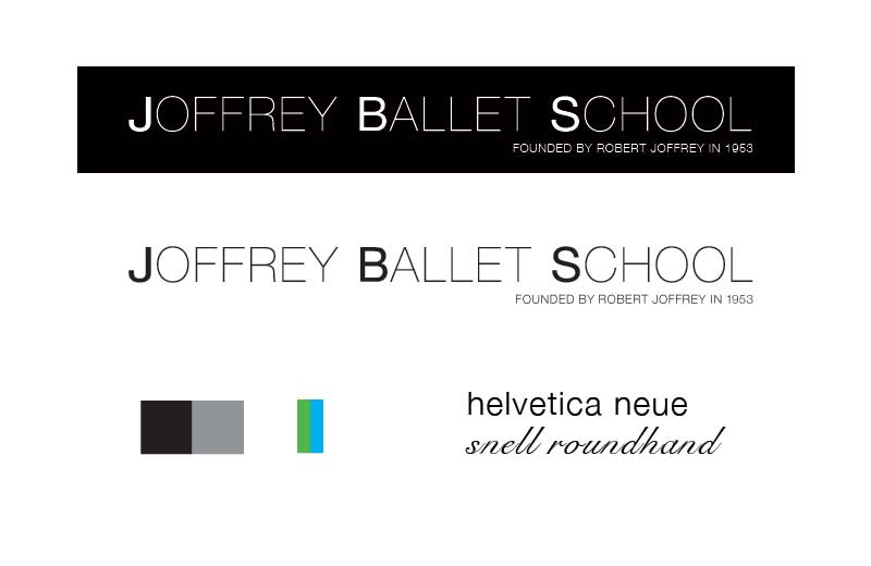
CASE STUDY A clean, clear logo, simple color pallete and the use of just two typefaces reinforced the modern elegance of the brand.
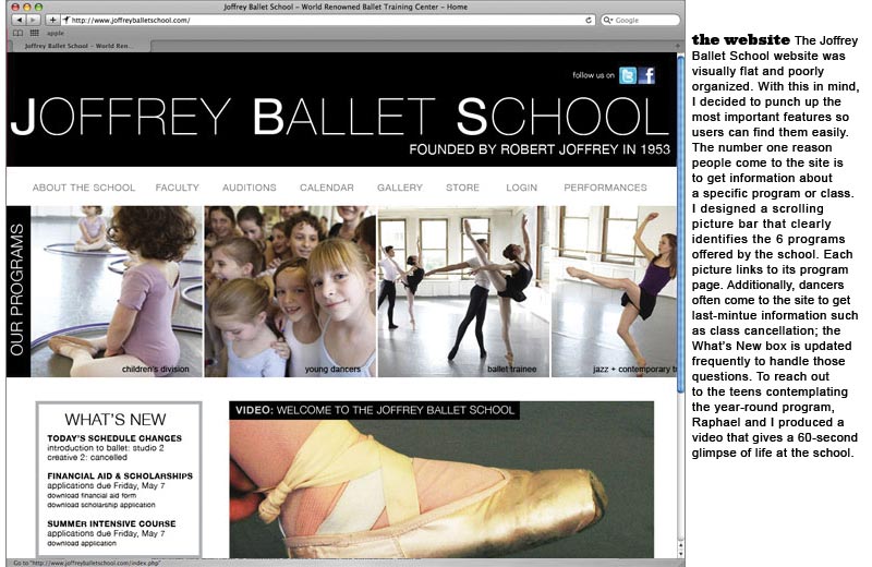
CASE STUDY The website redesign visually highlights the main areas of interest and organizes information heirachically.
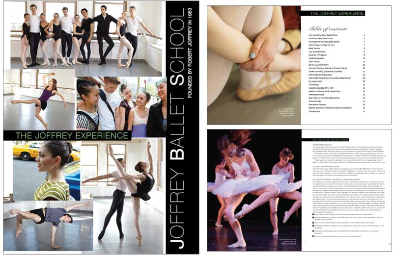
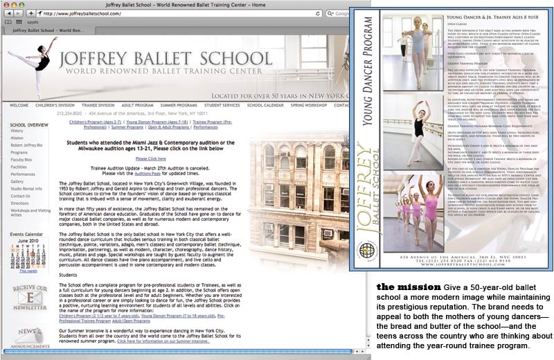
CASE STUDY A large format catalogue was produced for prospective students interested in the year-round trainee program.
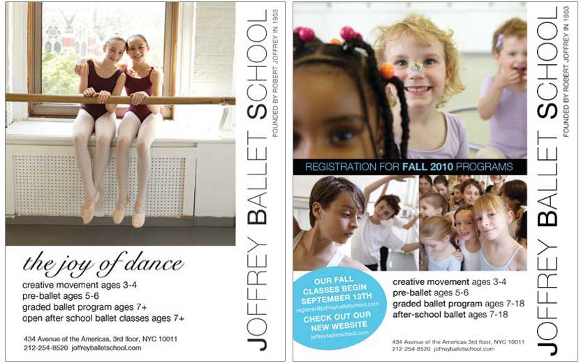
CASE STUDY The school runs dozens of ads of different sizes; I developed a grid system that adjusts for each program and ad specification.
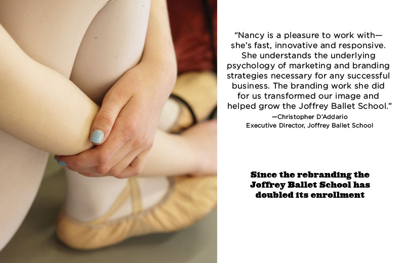
CASE STUDY My branding work with the Joffrey Ballet School is ongoing.